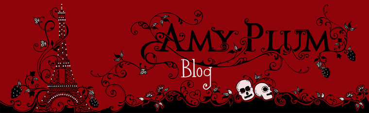


The HarperTeen U.S. cover for IF I SHOULD DIE
And here it is in all of its copper and gold and sunrise colored magnificence. The last book in the series. I’m getting a little bit teary-eyed.
I can’t WAIT for you to read it. There are so many fun surprises in the book. So, once again, here is the flap copy—now updated so as not to give a Book 2 spoiler!!!
I will not lose another person I love. I will not let history repeat itself.
Vincent waited lifetimes to find me, but in an instant our future together was shattered. He was betrayed by someone we both called a friend, and I lost him. Now our enemy is determined to rule over France’s immortals, and is willing to wage a war to get what they want.
It shouldn’t be possible, none of it should be, but this is my reality. I know Vincent is somewhere out there, I know he’s not completely gone, and I will do anything to save him.After what we’ve already fought to achieve, a life without Vincent is unimaginable. He once swore to avoid dying—to go against his nature and forsake sacrificing himself for others—so that we could be together. How can I not risk everything to bring my love back to me?
And for those who like to compare, here are the two covers side-by-side. Both so beautiful. I think I’ll go bake some brownies for the Cover Fairy.

UK Cover
US cover
183 Comments to IF I SHOULD DIE U.S. cover reveal
by Petra - On October 22, 2012
Beautiful cover and colour scheme! 😀
Warning: Undefined variable $oddcomment in /home/clients/ad873316c640d27ddae2dc82f1e61a9a/web/wp-content/themes/Amy-Book1/comments.php on line 33
by magan bagan - On October 22, 2012
I’m so excited for this! Such a gorgeous cover, at after that ending (especially since I read the ARC)… Beyond freaking excited!
by Lucero - On October 22, 2012
amazing and who won the frog?
by Vicki Orians - On October 22, 2012
So exciting!! Can’t wait!!
by Jayjay - On October 22, 2012
Ohh Amy, I’m getting teary eyed myself! I loooooove it! <3
by Hannah - On October 22, 2012
I think I prefer the UK edition! I love the US, it’s very bright, but I don’t like the girl on it. She doesn’t look…well, real. And with the ribbons of gold on the top, it looks a bit cluttered, while the UK one is simpler. Both teams have done a great job though!!!
by Bella colella - On October 22, 2012
I think I like the UK cover better, I like that you can see the city in the background better in that one and i love the heart around the title! I also love that your name is bigger and I just think the font is better. I do love the dress in the US cover a little more its very pretty looking with the design on it. But all in all I like the UK cover better but both are amazing!! thanks for this chance to win a book Iam doing this for my daughter she is in LOVE with the series and wants this one so bad!! hahah I love the series as well but I give her first pick!!;)
bellaxxx
by jade - On October 22, 2012
i love them both!!! they both reflect that pairs love story feel which the die for me series is about – love conquers all… even death ( i hope).i’m dying to read if i should die!!!
by Louisse - On October 22, 2012
Both are lovely but I love the heart in the UK cover! The orange background is so pretty!!!
by Paola Delgado - On October 22, 2012
I think that the cover UK is better, cuz Doesn´t have a lot element like the other is simple, and when I see the UK cover I feel melancholy. And the heart look like a part of the girl. Oh, I like the shadow, look like Vincent? I guess? …. Well this is my point of view
by Zach Payne - On October 22, 2012
I love the US cover, it seems more vibrant.
by Allison - On October 22, 2012
I love the dress in the UK cover but not feeling the heart so much. Your other covers didn’t have a shape just elaborate design which i absolutely love! With the heart your books wouldn’t be consistent, hope that makes sense. The US cover colors are much more brighter which makes it attractive unlike the UK cover which looks to me pretty dull. Hmm now that i look at it more, the dress in the UK cover makes her blend into the city and the wall. She should stand out. Over all i just love the US cover.
by Mayra Arellano - On October 22, 2012
I love the brightness of the US cover but I prefer the UK cover because it’s beautiful and the vines don’t take away much from the view of the city. Thank you so much for the opportunity!!!
by Tiffany B. - On October 22, 2012
Both are absolutely beautiful but I prefer the US cover since the color combinations are much more intense and vibrant. I love the swirls and the font more on the US cover as well. <3
-Tiffany
by Solange - On October 22, 2012
im not sure! in the uk version you focus more on the background and the girl but the us version you focus more on the swirls!
i think ill go with the us version because i just love the swirls!
i wish the cover was green though!
by leighmarbella - On October 22, 2012
Love both the covers but I prefer the US version. The swirls (i just love swirly stuff. hehe.) and color scheme is just awesome! The dress is to die for!
by Khalia Guidera - On October 22, 2012
UK, although I’m not such a fan of the stylised heart surrounding her. 🙂
by Tara - On October 22, 2012
I like both covers, But the US cover really draws your eyes to it’s brightness and makes you want to pick it up.
by Jenny V - On October 22, 2012
I like both covers, but probably the US one a little more with its color scheme.
by Nicole M - On October 22, 2012
I love the US one, mostly because I think the colors are richer, and I like the red of her dress instead of the black. Can’t wait to see this cover in finished-copy glory! I’m so excited to read this. Thanks for the awesome giveaway 🙂
by Dominique Goodall - On October 22, 2012
I definitely prefer the US cover because of the attention it brings to the title.
by Kendall McCubbin - On October 22, 2012
I love both of the covers! They are quite similar but I am sort of leaning towards the UK cover! I love that you can see the sky more and also the love heart!
Thank you so much for the giveaway!
by Ti Colluney - On October 22, 2012
We prefer the UK one as it appears more realistic and appealing. Both covers are gorgeous but the UK one has that slightly higher appeal. xxx
by Tal Rejwan - On October 22, 2012
I LOVE both, but I slightly like the US cover better. the beautiful color really catching my eyes!
Thank you so much for the giveaway~!
Can’t wait to read it!
by Adriana - On October 22, 2012
I like both covers, but I like the UK version better. The layout fits the series better the the US version. I especially like the heart shape on the UK version. I do love the colors and brightness of the US version though too. Still, I like the UK cover best.
by Len D. - On October 22, 2012
They’re both gorgeous! Though I prefer the US cover a bit more because the color really pops out and pulls you in.
by Monica Gutierrez - On October 22, 2012
WOW!!! Those covers are beautiful! I love the US cover most, simply because it is more vibrant and those vines are amazing. I love how simple the vines cover your name! Not too big, and not too small. And the color of the girl’s dress stands out. They both look great though!
-Monica G.
by SP @ Oh! Paper Pages - On October 22, 2012
I LOOOVVVEEE both covers, but I prefer the UK cover. The colors are more romantic and intriguing than the US cover. The US cover looks like someone went a little heavy on the photoshop options. I love that there is a shadow on the bridge. WHO IS HE!? Thanks for the giveaway!
by Stephanie P. - On October 22, 2012
I prefer the US version because it sort of fits the design of the other two books slightly more than the UK version.
by Amanda Collins - On October 22, 2012
I love the scrolling and the brighter red dress of the US cover. That is my pick
by Rebecca Robertson - On October 22, 2012
I love the simplicity of the UK cover but the colours of the US cover i love as well. Well done to the artist love them
by Aislinn - On October 22, 2012
I love them both but I love the us cover it caught my eye straight away and it goes with the whole adventurous/love theme too !! I think a load of people will pick it us because it so adventurous and still simple…I love them both though
by Charlotte Thorstein - On October 22, 2012
I prefer the UK version. The US one is too flashy and the girl on the cover looks a little fake. Also, I find the UK version more romantic, therefore more fitting for this book. I really like them both thou!
by Carly Jayne - On October 22, 2012
I love the UK version best! I love the subtlety and the heart pattern around the writing that travels down and wraps around the dress. And I love how gorgeous the city looks!
by Jassie - On October 22, 2012
I can’t pick between the two! 🙁 Both are awesome in their own ways yet here’s my dilemma:
UK cover – I like how it is not too much showy, the vine-design is simple, I love how it became a heart-shaped one.
US cover – I like the simplicity of the text itself, the gold vine colored intricate design yet I think the top vines are too much heavily loaded. I love how the sunset-orange-color pops; it brings a lot more life in it.
If the US cover’s vine is like the heart-shaped one like the UK cover, it’s a hands-down! 🙂
– dream design: US cover overall but the vines from the UK cover. Retain the text/font used; Gold-lining vines; and the popping but not too flashy orange-sunset colored background 🙂
I CHOOSE THE US COVER!!! (weighing my pros :D)
by Katherine K. - On October 22, 2012
They’re both lovely <3 I prefer the UK version because it seems more romantic
though I also kinda like how vibrant the US version is ^-^
by samantha atkin - On October 22, 2012
I do like them both if i where to chose it would be the UK COVER.The colours are sharper and brighter on the US cover but all the swirling at the top of the title is abit distracting.
The UK cover is duller colour wise if you could take the colour of the dress from the US cover and put it on the UK cover it would be perfect just my opinion of course.x
by Precious - On October 22, 2012
I like the UK cover better. Because:
1. I can see the pretty landscape behind the girl.
2. Too many swirly stuff in the cover is too much I think.
Yay for this!
by Jenny Needham - On October 22, 2012
I love both covers although the UK cover does get my vote. The slightly darker background bringing out the cover better making everything just that little more eye catching. I love the extra detail entwining her dress and the heart detail around the book title makes for an awesome look. Although knowing that I will love the contents, I would happily have either cover on my reading shelf
by Pavan - On October 22, 2012
I absolutely love both covers but my favourite would be the US cover because it stands out so march, and I love the sharper features of all the aspects of the cover 🙂
by Artemis - On October 22, 2012
I like both covers, but I prefer the US version better. Because the colors are brighter and the red dress is amazing!
Thank you for the giveaway!
by Grace Lo - On October 22, 2012
While I find both covers amazing, US gets my vote. I love the pop of colour, as well as the font which seems to fit much better with the editions of Die For Me and If I Die that I’ve read. The more intense lighting on the US cover makes the contrast between colours much, much better, and while I think that the heart swirly on the UK cover isn’t a bad idea . . . it seems too . . . definite. I like how the US cover’s swirly thing isn’t symmetrical.
by Kathrin S. - On October 22, 2012
first of all i would say the cover isnt my most important part of the book im dying to read whats written inside and would even buy it with a plain single coloured cover… but as this isnt as much about the book than the cover i would chose the UK cover i think… all though i like the colour intensity of the US version better but we had all the swirls at the top on the ‘DIE FOR ME’ Cover so im happy with something different ;).. and i prefer your name being the quell of the swirls so YES i like the UK cover best!!! x
by Zeenat - On October 22, 2012
I love the US cover cause it is more illuminating and more defined. I love the way it highlights the “if i should die” aspect and it left me breathless. And i love the way the colours intersecpts each other without contrasting.
by Giulia Anna - On October 22, 2012
The covers are both beautiful but I like the UK edition more. The colors are softer and the atmosphere seems romantic 😀
I like the fact that the title is inside a heart and I like the font used.
by Isabel Jerm - On October 22, 2012
I love borth of them, but I prefer the UK version. It look so fresh and lovely.
I love the dark colours, and the heart shape.
I love the font Amy Plum is written in. 🙂
by Jane - On October 22, 2012
Such beautiful colours on the US cover!
by HayleyAG - On October 22, 2012
I think I prefer the U.K. cover, the U.S. one just seems a bit too busy. But they’re both gorgeous 🙂
by Linnea - On October 22, 2012
I think I like the US verson best, the colors is much more vibrant and your eyes is drawn to it more.
Btw the shadow is not hers right? It dose not look like hers….
by Aviva - On October 22, 2012
My eyes were immediately drawn to Vincent’s shadow watching Kate in both covers. As far as comparing the two goes: My perfect cover would be the lower half of the UK cover and the upper half of the US cover. I think that the more subdued and grey colors of the UK cover place Kate in the shadow world, in which she was first kind of forced to become a player and as I understand it will now choose to become a fighter, better than the bright burning red dress does. It alludes to the stone of the fountain in JB’s front yard as well as to the loss she felt on the bridge when we last left her.
The sunset (and yes, I double checked with a map whether we are looking west or east from the bridge and it is West, so sunset) is better caught in the US cover. For one thing, I’m not so much the heart type – I like subtle hints like Vincent’s shadow and am not a fan of driving things home with a hammer. And then, though the stronger saturated colors burn brightly they make the scene appear more peaceful, like the sky is still burning after a hard and long fight, but it is over now and the air is filled with accomplishment and maybe more victory than loss and mourning.
by Samina - On October 22, 2012
I like the UK cover more as t is more subtle. The US cover is brighter but a lot of things are going on distracting the eyes. The UK cover takes your eyes straight to the model. Lush!
by Maggie - On October 22, 2012
I like the US cover better because of the the brighter, vivid colors, and the larger amount of the floral artistry around the cover.
by Tiffany S - On October 22, 2012
Really love the US cover!! The brighter colors are beautiful.
by FairyWhispers - On October 22, 2012
I prefer the US cover. It’s definitely brighter and it ‘pops’ out more. I think Vincent’s shadow is more pronounced on the US cover too. The swirly decoration on the US cover may be a tad to overwhelming though. The best part though, is the font on the US cover. It’s much more neat, simple and looks professional. In my opinion that’s really important. It gives the image that the book is written professionally too. Plus Vincent’s shadow is bigger, that means closer! teehee 😉
regards,
by Karis Valentine Cole - On October 22, 2012
That’s a tough one But I think I like the US better just because of the direction the vines take you eye through the title and then to Kate in the Parisian landscape. The heart On the uk cover is cute but I think it is a little cheesy
by Klaudia - On October 22, 2012
Honestly, both covers are simply amazing. I adore the color scheme, the font and the gold patterns. In my opinion, however, I think the cover on the right would quite the series better. The heart on the other cover is cute and all, but I think the with the way the gold pattern surrounds the letters and wraps around the girl is both suiting for the series and really allows the last book to stand out; as a way to end with a grand finale so to speak. That’s just my opinion but I can’t wait to read this book, I simply adored the last two novels so this is a must. Thanks for hosting this contest(:
by Jenna @ Making the Grade - On October 22, 2012
I definitely prefer the US cover. The colors are more vibrant, the title is nice and clean surrounded by the accents, and, all in all I prefer the overall composition. Can’t wait to have this in my hands!
(Good luck to all who enter for the signed book! May the odds be ever in your favor!) ;)~
Jenna DeTrapani
imakethegrade at gmail dot com
by Krystal Pipikos - On October 22, 2012
Personally I prefer the US cover because it still shows the love nad heartbreak of the story while capturing the readers eye with it’s vibrant colours. Plus the swirl art work match the other two covers (Die For Me and Until I Die covers).
And I love Vincent’s shadow watching Kate, the perfect touch to both covers!
by Ella Yang - On October 22, 2012
I think i like the UK cover better as the girl there looks more…real. It’s not that photoshopped (I think at least).
by Chyna - On October 22, 2012
For me I prefer the plain and simple one, the UK cover looks more vintage and it suits the story. The US cover may be vibrant and colorful, but it doesn’t suit the whole plot. I hope I’ll be getting the UK cover.
When I first saw both of the covers the first one I noticed was the UK cover. Even though it looks dark and mysterious it suits the book and everything. The US cover’s intricate design is phenomenal, but I would still prefer the heart shaped cover. It would catch the eyes of the hopeless romantic readers like yours truly.
-Chyna
by hiba008 - On October 22, 2012
Congratulations Amy!
I think I like the UK cover better 🙂
by Jeynelle vidotto - On October 22, 2012
Us cover speaks to me of the sun setting on the story of the love between vincent and Kate . The red of her dress shows the love and passion of their journey through life and death and all that is in between
All said though, it is difficult to fault 2 amazingly alluring book covers that draw me in
Well done to the artist. I would hang these on my wall as art
Xxxx
by Samantha F - On October 22, 2012
Both covers are beautiful. But I am one of those people who wants all of her covers to stay the same. So I like the US version better. Plus, it is more vibrant and alive than the UK. And I just noticed that shadow of Vincent…Getting excited now!! 😀
by Michelle Cable - On October 22, 2012
US, but only by a slight margin. Love the color scheme & design. It’s really eye catching. But then I do love the Heart shape of the UK book.
by Kaitlyn - On October 22, 2012
Both covers are absolutely gorgeous. While I love the vibrancy of the U.S. one, I think I like the UK one better. I love the heart on the top around the title. 🙂
by BUSRA - On October 22, 2012
I like US cover more. Because it is more golden like and it shows us how magical the city and the story is. Under that beautiful sunset how impossible and magical things can be made real. And the red dress make people think about both blood and love 😉
by Juana A - On October 22, 2012
Both covers are beautiful but if I had to pick one I would pick the UK cover. I like the way the writing stile, the swirls color is not over powering the rest of the cover and the shadow I assume is Vincent’s shadow is perfect shade it makes it look like he is far away, it reminds me of the ending of the second book.
Thanks for the giveaway 🙂
by kelsey d - On October 22, 2012
I like the US cover best, it just seems to POP more! :). Thanks so much for the giveaway!
Poisnivyred AT gmail.com
by Emily - On October 22, 2012
I definitely prefer the U.S. cover. I like the more vivid colors. Also, the UK cover seems to in a way narrow the story, meaning it is so much more than just a love story. The characters…all of them….go so much deeper than just the romance factor. The U.S. cover seems to fit better with the other two books in the series, as well. Either way…..amazing trilogy!
by Myra White - On October 22, 2012
Oh my gosh, what craziness is this?! How do you expect someone to choose?
I love them both, they each have their on flavour and are just gorgeous. I really like the copper colourings of the US, but the UK has a beautiful font and the swirly doo-dads are very pretty-ful!
I think I am slightly more in favour of the UK cover than the US, I like the less-vibrant colours and the swirls and the font and the dress and the scenery and… I could go on for a while here. They are absolutely gorgeous covers and you should be extremely happy with them both!
by Kasper - On October 22, 2012
I like the US cover the best! Here’s why:
1: The colors are brighter and more vivid.
2: It matches my copies of Die For Me and Until I Die – so this is the one for me, since I need a matched set!
by Nikol K. - On October 22, 2012
I really like the US cover because the color scheme is so bright, it really draws attention.
by sarah dowlin - On October 22, 2012
I like them both, but if forced to choose then I pick US. 🙂
by Susan - On October 22, 2012
Both covers are absolutely beautiful. The skyline, the way her body is standing, determined to follow her heart, and the silhouette shadow in the left hand corner. If I were to choose, though, I would lean towards the UK cover for a few reasons.
1. The swirls are beautiful and represent the eternal love story, but I think they are better balanced in the UK cover.
2. The font is more striking and has an almost timeless appeal. And the drop shadow adds depth.
3. Though the colors are stunning in the US version, I think a bit softer and less contrast do give it more elegance. And the story is elegant.
But both are stunning!!
by Stephanie Ehmann - On October 22, 2012
I love them both, but if I had to choose I would pick the UK one. The Yellow boarder in the US one is a little too crowed, where the UK one is a heart. But what I love about the US one is the font and her poke a dot red dress. Very cute!!
by Sarah Nicholson - On October 22, 2012
The US! So beautiful! Hope I win!
by Suzanne - On October 22, 2012
Tough choice! UK if I really had to pick just one – I think the swirls are better on the UK cover; they’re a little more subtle, and I like the heart. I like the dress color on the US cover, though.
by Von P. - On October 22, 2012
U. S. for the win! The U. S. cover is much shiny and vibrant which make the cover realistic. Details like the vines are a lot more than that of U. K. but I also like the heart-shaped vines of the U. K. cover.
by Samantha Jean - On October 22, 2012
Both covers are beautiful but to choose one: UK version b/c the girl on the US one looks too fake and it makes the cover seem not as professional (more like one I’d see on a self-pubbed). But I like the title, byline, and scroll work on the US version better. Not sure which color scheme I like best…both have pros and cons. Thanks for the giveaway! 🙂
by Jenny the librarian - On October 22, 2012
I like the brightness of the US cover but I LOVE that heart on the UK cover.
by Gabrielle - On October 22, 2012
I like the UK cover. The muted colors are more pleasing to the eye than the very bright ones in the US. But there’s both very pretty and like the choice of the sunrise colors! 🙂
by Heather - On October 22, 2012
I prefer the US one. It’s brighter, more vibrant and I just like the color combination. Also, maybe I’m biased because that’s the one I’ll be getting when it comes out.
Heather
by Celyn - On October 22, 2012
I like the UK cover better because it’s more understated. The US cover, was exceedingly lovely, is just a bit too busy for me; maybe if the swirling yellow was a bit more muted. I’m sure however, that the story inside is going to be fantastic!
by Sinuon Virak - On October 22, 2012
I love the US cover more since i’m American!!! But also because it matches the other 2 books I own which are boh American version!
by Lisa - On October 22, 2012
UK version 🙂
by Livia May - On October 22, 2012
Both are really beautiful, but I like the US cover more. I the colors are brighter and more vibrant, I love that the dress is more red, like fire. The UK one is beautiful but like a simple beauty, it reminds me of like a coffee shop color scheme, which kind of fits! But my heart goes to the Us one, I’m more of a bright photography kind of girl. =)
by Helle - On October 22, 2012
Omg, they’e perfect, I absolutely LOVE them both! However, I prefer the UK one because it’s darker. The colors fit more together in the UK one than the US one. The heart is also a detail that makes me prefer the UK version 😀
by Kelly Fine - On October 22, 2012
Wow-I love them both, but I really like all the fancy scroll artwork on the US version-more so than the heart on the UK one. Love the vibrant colors on the US, but the darker, more subtle version on the UK one appeals to me as well. I am really not sure which one I like better…so I’ll say both!
by Sandy S. - On October 22, 2012
This is an amazing series. I cannot wait .
Both cover are spectacular. The UK version is less ‘busy’ and I like the heart effect.
by Tamara - On October 22, 2012
I have to tell you, I prefer the US cover, but only slightly, because the colors are more vivid. But still, both are breathtaking and I seriously cannot wait to read it! 🙂
by Janet - On October 22, 2012
I like the US cover better because of all the swirls! So pretty! Thanks!
by samantha m. - On October 22, 2012
Wow, they are both gorgeous! But I think I like the UK version a tad better. It’s a bit more simple.
by Tânia - On October 22, 2012
I like the UK cover better because it has a simple beauty 🙂
by Kandis Eccles - On October 22, 2012
They’re both very pretty, but I was immediately drawn to the US cover. It’s so vibrant, but still captures that dark feeling. I also love the simplicity of the smaller font with the ornate swirls.
by Kelsey Dietrich - On October 22, 2012
Both covers are nice but i would prefer the UK cover if only because it is darker
by Tammy Sparks - On October 22, 2012
I think the UK cover, because I like the way the vines create a heart. Both are beautiful!
by Delphine - On October 22, 2012
Both covers are beautiful but I prefer the US one because of the colors much brilliant. Thank you Amy for such a great giveaway !!
by Lexi E. - On October 22, 2012
I like the UK one better, I think. I like how the colors are more muted. But I like the design of the vines better on the US cover. But seriously, they’re both gorgeous!
by Ivy Ng - On October 22, 2012
I love the UK cover so much! The city scenery on both cover looks amazing but colour on UK cover seen more vivid 🙂
by Rowena - On October 22, 2012
Both covers are gorgeous, but I like the more vibrant colors of the US cover, the red dress and the twirly vines.
by Nicole McCormick - On October 22, 2012
I prefer the warmer colors of the US cover. That being said, the only thing that bothers me about the UK cover is the heart. If the design wasn’t in the shape of the heart I would probably actually prefer the UK cover. Both are gorgeous though.
by Kristin - On October 22, 2012
Amy, it is simply stunning. I can’t wait to have all three side-by-side-by-side on my bookshelf. And to read them all in a row. And to one day have you sign all three. SO very excited for you; you deserve all this happiness and success.
~Kristin
by Ruth M - On October 22, 2012
I like the US cover the most because the colors contrast well together and gives it an sunlight glow. I also like the cover because it is so vibrate and eye grabbing. The dress on the girl is so much prettier and I love the swirls cascading around the title. Finally why I like this cover more is because it has the background of Paris on the front cover and its more visible to the audience! 🙂
by susi - On October 22, 2012
i like the uk cover! i thi.k that sime is better xD i can’t wait for this book!!
by Tiffani - On October 22, 2012
I love the US cover. The colors are so rich and vibrant, making me want to go to Paris to see if this sunrise is THAT rich in real life. The gold is beautiful…
by Crystal - On October 22, 2012
Love the US cover!!! It has an overall better look with the colors being brighter. To me it gives off stronger emotions!!! The UK cover feels unfinished to me. Can’t wait to read the book!!!
by maria - On October 22, 2012
they are but beautiful but i like the US better!
by Ashley Gould - On October 22, 2012
I love them both, but I have to go with the US one. It keeps that same theme as the other two books yet has something more. The orange/red tint can either be a sunset for lost hope or a sunrise for a new beginning. Either way I am VERY excited to get this one when it comes out!
by Noel - On October 22, 2012
I love the Uk cover!
by Mona - On October 22, 2012
The US cover because the colors are much brighter and it draws in the readers!!! 😀
by Caitlyn Santi - On October 22, 2012
I prefer the U.S. cover! But they are both gorgeous! I like the brighter more vivid colors of the U.S. one, I don’t know… It just seems like to me that one is more stirring. I am so excited to read If I Should Die!
P.S. From reading these comments, I saw the shadow on the cover for the first time, that is a really cool element!
by Joanna Ward - On October 22, 2012
GOLDEN, Amy!!! Both covers are stunningly beautiful, but I’m favoriting the US cover more! And here’s why. #1) The gold… loving it! I think the color is only befitting since this is the third and final installment with Kate & Vincent. #2) The white font! I love white type. To me, white stands out better on covers, especially on spines. And the font, itself, is much more elegant, which supports the backdrop of what Europe is. #3) I’m more previe to plum dresses than brown. 🙂
Although, I do like the heart shape design around the UK’s cover titling. It helps in the questioning of “If I Should Die” and makes the answer ever more important. But again, I like both covers. Each is its own beautiful. I’d be happy with either. Mad props to the designers… G8T WORK!
by Erica - On October 22, 2012
I love the US cover her dress just stands out more.
by Erin - On October 22, 2012
I definately like the us cover better its brighter and seems to show more hope, whereas the uk cover seems depressing in its colors!
although im dying to know who the shadow is that is against the railing support in the lower corner…..
by Tiffany Borka - On October 22, 2012
I think I kind of prefer the UK cover. UK books always get the best covers but I like the colors on it an it doesn’t have all the swirls in the background like the US cover. Though, I think if you were to mesh the two together it would be perfect 🙂
by Elizabeth Ramirez - On October 22, 2012
I love both covers as they are both beautiful and there is something I like about each one. If I have to choose I would say the US cover though as the colors pop more out at you but, I like the whole heart idea and how your name stands out more on the UK cover.
by lupe saldivar - On October 22, 2012
i like the UK cover a lot more than the US cover. the US cover is too busy with so many swirls just everywhere, plus i live in the US so of course there is a bit of wanting the one i can’t have going on too. 🙂
why can’t it come out sooner? like christmas? that would awesome! lol, *sigh, its just so long to wait on pins & needles to know what happens! 🙂
by Daisy Richeson - On October 22, 2012
I love them both! I like the US one better because of the coloring, but I do love the heart on the UK cover. Can not wait to read!
by Maddie - On October 22, 2012
They’re both lovely, but I especially love the UK one!
by Rachel - On October 22, 2012
I don’t know…I like the bright colors on the US, but the girl doesn’t look real. she looks like CG (computer graphics….)
by Rachel Bradshaw - On October 22, 2012
HELLO THERE!
So I love both the covers but I do have to say I like the UK one more as it is more subtle and the colours are less in your face. Plus the colours look a lot more romantic as well as red (maybe danger :O )This just maakes me even more excited for the book and eager to read it 😀
by Lorah Derryberry - On October 22, 2012
I love them both but I think I prefer the UK one….. I love the heart! Can’t wait for the new book!!
by Dervla Candon - On October 22, 2012
i think i prefer the UK cover, i love the font and the way the design spirals up into her hair!
by Steph Trujillo - On October 22, 2012
I prefer the US Cover because looking at from an artist’s perspective I feel that the girl on the cover stands out more because the gold doesn’t seem to COMPLETELY engulf the girl and allows her to be the focus of the viewers eye. 🙂 Her color also is more vibrant which absolutely helps 🙂
by Adriana C - On October 22, 2012
My favorite is the US cover! I prefer the font, the intensity in its colors and the twirl pattern.
by Nicole Toms - On October 22, 2012
Wow, I can’t believe the third book is already on its way! But I’d say I definitely like the U.S. cover best because it’s so vibrant and the pattern is similar to the last two books. I can’t wait to read it!!
by Lauren Brown - On October 22, 2012
I think I prefer the US cover because it has so much more color. In the us cover her dress is actually red which makes the yellow rapped Arlington her really pop. Also they way the sunset is so much brighter you can really see the Paris skyline. Altogether the colors on the US cover are just so deep and rich making it really eye catching.
by Lanae Bouchez - On October 22, 2012
The US is definitely my fav. It’s eye catching.
by May - On October 22, 2012
I prefer the UK cover. The US is too golden for me.
by magan bagan - On October 22, 2012
While I like the sweetness of the heart in the UK cover, I like the U.S. cover better. The brightness of the gold offers a kind of hope for how the story is going to go and what we can expect…
by Veray Carter - On October 22, 2012
I think it is lovely! I can’t wait to read it!
by rosalie hobbs - On October 22, 2012
AHHHHHHHHHHHHH!!!!!!!!!!!!!!!!!!!! omg Amy i luv luv luv it! why can’t it come any sooner??? 🙂
by Veray Carter - On October 22, 2012
I think I like the US cover best. More bright and the swirly things don’t cover up the girls hair and arm. I like the red more than the brown colors too.
by jacklin Updegraft - On October 22, 2012
I love the US version it’s brighter. It made my eyes continually go back to that cover.
by Dalitza - On October 22, 2012
First of all thanx Amy for sharing! You’re awsome!
I like the US cover because it has more vibrant colors, like Vincent and Kate’s love for each other. And even though the heart on the UK cover is nice, this is the third book of a series we all know is a love story, so again, I like the emphasis on the coloring and Kate and Paris of the US one. One question, what’s with the shadow on the lower left corner? Is it supposed to be Vincent? Because it looks like it’s of someone with short hair.
by Lauren Goff - On October 22, 2012
I prefer the UK color scheme and the US vines. XD The US detail work match the other covers better but I really don’t care for the overly bright colors! Both are very pretty designs though!
by Lydia D. - On October 22, 2012
I prefer the U.S. cover because i love the bright lively colors especially the color of the sky, it’s very beautiful, whereas the U.K. cover seems kind of gloomy.
by Marie R. - On October 22, 2012
I prefer the US cover, the colors seem more vibrant.
by Amy - On October 22, 2012
I ABSOLUTELY LOVE THE US COVER!
IT HAS BRIGHTER COLOR CONTRAST AND IS REALLY APPEALING TO THE EYE. I LIKE HOW THE ORNATE GOLDEN SWIRLS DON’T COMPLETELY ENGULF HER SO SHE BECOMES THE CENTER OF ATTENTION.
THEY’RE BOTH AMAZING COVERS THOUGH! YOU SHOULD DEFINITELY BE PROUD! 😀
by Rebecca - On October 22, 2012
Even though I’m from the UK I have to say the US cover is amazing! It’s so beautiful. The red dress really makes me think of Kate. The golden swirls look beautiful and it really brings out the cover. X
by Jessca Russell - On October 22, 2012
They are both so beautiful but I think I like the UK version because of the heart, but that would be the only reason. 🙂
by Nancy - On October 22, 2012
They are both gorgeous but the little switly heart around the title on the UK cover had a a little special on it!
by Becky Louise Williams - On October 22, 2012
I prefer the UK cover, it’s not so bright and the girl (my guess is it is Kate) doesn’t look so cartoon like on the UK one like it does the US one, I also like the UK one as I’m from the UK so I will end up with the UK cover 😉
by PamM - On October 22, 2012
Wow it’s a hard choice. I like the title better and the heart on The UK one but like the background color and the girl better on the US. Can we combine them lol. If i had to pick I would go with UK no US oh I can’t pick!!
by Jolene A - On October 22, 2012
I am going with the U.S. cover. I actually like it being more bright. The dress pops a little more and I think the brown dress blends in a little with the bridge. I like the decorations around the title more, it stands out more and is more decorative
by reading mind - On October 22, 2012
I prefer the US cover. The colors are brighter and the girl is more on the foreground. Also, no heart-shaped framing, which I don’t really like. But both are stunning
by Amrita - On October 22, 2012
I really love these covers but I think I prefer the US one because it’s brighter than the other one and because it reminds me of the cover of the previous books, which is an important thing to me. The design is really cool and I love the swirls !! 🙂
by Emma Y - On October 22, 2012
US cover is much prettier and vivid, prefer it as it stands out a LOT more 😀
by Frida - On October 22, 2012
Love both covers, but I do prefer the UK one because I think the colors are a bit too bright on the US. Also I like the font and the heart around the title on the UK cover. 🙂
by briana - On October 22, 2012
I prefer the UK edition. The design is simple but not over the top, and the dress color works much better, the US dress color looks too orange for my taste, but I love the color schemes for both!!
by Romana Hladká - On October 22, 2012
I like the US cover more. The details on the cover are really great. They’re light, but they’re still have dark feeling in them 🙂 It match the atmosphere.
by lindseyw - On October 22, 2012
Its hard to choose,but if I have too. Well then it would be the UK, eventhough I’m from the US. The color scheme on the US is beautiful the colors somewhat over shadows each other. On the UK cover the details stand out. Having the dress in a neutral color allows the surroundings stand out, and ties the cover together.
by Jasmine Rose - On October 22, 2012
I think I like the US cover best because it’s just a little brighter.
by Katelyn L. - On October 22, 2012
The US Cover, the colors are more vibrant and I like the design around the words better also.
by Paulina P. - On October 23, 2012
I really like both but i have to say that i like the US cover better. It just looks more vibrant and eye-catching. I think the colors really compliment each other to make this cover very beautiful.Its like i’m actually there in Paris now! Great work! Can’t wait to hold the actual book!!
by shelby von wahl - On October 23, 2012
I like the UK cover better, because it is less bright, what with her dress being a darker shade of red, and i like the heart swirl. and your name is bigger on it.
by Kimberly Konopinski - On October 23, 2012
This is hard. I like the US cover because of the color but I think I like the UK cover more. I like the simplicity of it.
by Alia - On October 23, 2012
Both covers are so beautiful! Eeeep, I’m so excited to read If I Should Die! 😀 I like the heart on the UK cover, but the colors on the US cover are better.
by Lucero - On October 23, 2012
I really like the Us cover because the swirls that twin around Kate is beautifully haunting and the shadow of a person at the end is a creative way to represent Vincent in volant form. Even though he is not there physically he is with Kate spiritually. The Us cover’s colors are brighter and show the true form of how Paris looks like during the evening. I also love how you showed the scene of Vincent and Kates’ first date.
by James - On October 23, 2012
I love the UK cover personally, because I feel it represents Kate’s inner emotions don’t get me wrong the US cover is stunning to, but I feel the darkness of Kate on the cover in contrast to the bright city explains her emotions, while the heart shows her love for Vincent will always be there no matter what.
by Stephanie T. - On October 23, 2012
I prefer the UK version. The US one has too much going on with the swirls, and I like the font of the UK one better. I love the colors for the US though.
by Zoila umana - On October 23, 2012
I dont no if its because im sick or because this cover is so beautiful but i started getting all teary eyes when i saw this US RULES 😉 i love it sooooo much
by Abigail Rackliff - On October 23, 2012
I prefer the UK cover art it is more simple but very beautiful I think the us has to much going on.
by Whitney Lauren - On October 23, 2012
I love the US one better because i like how the colors are brighter (which makes me feel happier in a way) and I love the designs that are intertwining on the top half of the page rather than having a normal looking heart surrounding the title 🙂
by Diana - On October 23, 2012
I LOVE the UK cover because of the heart! They are both very similar and beautiful!
by Vi Nguyen - On October 23, 2012
While the UK cover is equally gorgeous, the US cover does it for me bc I love the color scheme and the intricate design surrounding the title. Either one is a win though, I just can’t wait to get my hands on this bad girl!
by Enna P. - On October 23, 2012
I like the U.S cover better, it’s brighter and more eye capturing, the UK cover looks nice too, but the heart alone is to plain; it seems more fuller when it has the design all around the title like the US cover!
by Angela N - On October 23, 2012
I prefer the US cover because its more colorful and her dress pops.
by Megan Adams - On October 23, 2012
I like the U.S. version because it pops out with all the color!!! But they are both very beautiful.
by Stephanie R - On October 23, 2012
I personally like the US cover, one-I love the swirls around the title and cover for the reason that they seem to be coming out of the city itself (I am not sure hoe to describe it, it just seems awe). Two- I love how the colors are more vivid, the flame golden orange and the dress pops. The colors just stand out. The UK is pretty as well, I love the sepia dim dress and girl. It gives the cover a different feeling- older somehow.
by Natalie Yates - On October 23, 2012
I like the US cover better. Its more vibrant. Cannot wait.
by Stephanie R - On October 23, 2012
OPPS TYPO. I personally like the US cover, one-I love the swirls around the title and cover for the reason that they seem to be coming out of the city itself (I am not sure hoW to describe it, it just seems awe). Two- I love how the colors are more vivid, the flame golden orange and the dress pops. The colors just stand out. The UK is pretty as well, I love the sepia dim dress and girl. It gives the cover a different feeling- older (sort of somber) tone somehow.
by Rhian B - On October 23, 2012
I personally prefer the UK book cover, the US one is gorgeous but the Uk cover is a bit more subtle, without all the swirls you focus more on the picture 🙂
by Jen @ Midnight Book Thief - On October 23, 2012
I like the US cover more- its more vibrant, but the swirls are kinda too much. Both are really pretty though! 🙂
by amy - On October 23, 2012
Thank you all for your comments. I love how all of the aspects of the covers appeal to people differently! And the winner of the signed copy of UNTIL I DIE is: Lucero!
Lucero, send me an email to my address on the Contact page and I’ll pop the book in the mail to you! Merci to everyone who participated!
by Kate - On October 23, 2012
Both covers are amazing. But if I have to pick one, I would go with the US cover. first, the colors are much vibrant as opposed to the UK one and the vines are much detailed. I think it symbolizes so much about the story. I also loved that the gown is more livelier and you could actually see the design of it! The font is simpler than UK and I really loved simple fonts!
US cover is my favorite and it’s another cover-inspiration that I would definitely do on my nails! <3
by Manasvini - On October 23, 2012
I like the UK version because the colors are more faded, so the book seems darker and more suspicious,
by Manasvini - On October 23, 2012
The U.K versions colors are more fades so it seems more suspicious and enticing.
by Geraldine Frost - On October 23, 2012
I pick the US cover. The rich warm shades of orange are enticing. Orange is a colour that evokes passion and change to make things better and to reach for the future.
by Natalia Belikov - On October 28, 2012
KYAAAAAAAAAAAAA!! I love it! I love both covers but the US gives me this wonderful “sunset” feeling! <3333333
Totally gorgeous! <3 can't wait for the release day sniff! OMG… but I don't want it to end either sniff! not faur! snifffff!
by Gabs22 - On November 26, 2012
OMG!!!!!!!!!!!!!!!!!!!!!!!! I CANT WAIT :]
by Esperanza - On December 27, 2012
Both covers are amazing! One looks dark and mysterious, while the other kind of gives you a feeling of hope. They are both stunning!
Trackbacks